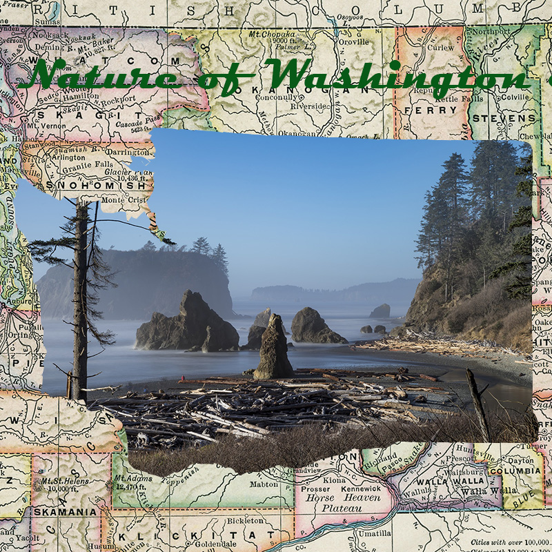
This graphic design was very fun to create. I was born in Yakima, Washington and grew up in the country around nature so this design reminds me how great of state I live in. I love nature and always have, so I thought it would be a cool concept to photoshop a photo of the coast of Washington into the State of Washington itself. I put a map of Washington behind it to give it a better look and to show the rivers, cities and counties of this great state.
There is a bunch of nature in Washington and we are one of the states that makes up the Pacific Northwest, which is very nature oriented. Nature is beautiful in so many ways and I hate when I see videos or photos of it being destroyed by pollution or deforestation. I have always had a soft spot for the environment and I love how beautiful and raw it is.
Nature is what makes planet earth so unique. Nature is life, and you cannot find life anywhere else in our solar system. That is what makes it so precious, and it makes me sad when I see it being destroyed. I am truly blessed that I grew up around nature and in a state that is one of the most beautiful states in the United States. They don’t call Washington “The Evergreen State” for no reason.
I did not take these pictures myself. I found one from Pixabay, one of the sites that the website guide provided. The other two pictures are from google images but I made sure that they were free to use and made sure I wasn’t breaking any copyright rules. Here are the links to the photos as proof that they are okay to use:
https://pixabay.com/en/beach-pacific-coastline-ocean-coast-2090015/

I think it is so impressive and interesting how you incorporated the inner photo as the cut out of Washington state! The quality of the photo is great. Also I appreciate that the background map is of Washington. Your title clearly connects to the design and the story you are trying to tell is clear. For my first critique, putting a background behind your text “Nature of Washington” would make it much easier to read and it wouldn’t get confused visually with the text on the map. I do understand that the cutout of WA is considered a third image, but it would be nice to maybe incorporate some more detail like drop shadow just to add a little more. I think it is very cool how you incorporated your love for your home state into this project. I would have loved to see a photo you took yourself I Yakima or anywhere else in state, but the one you chose is beautiful.
LikeLike
The rough draft you created is very unique and the design you created through Photoshop looks like something that would be very difficult to master. One suggestion I would give for your piece would be to make the letters a little more visible. I didn’t see the “Nature of Washington” at first because it kind of blends into the busy background. I would either add a darker color for the letters or a border around the letters so they stand out more. Next, I would maybe incorporate more pictures into the Washington shape you created so people can get a better idea of places you might be covering in your blog. One area where I think your design is particularly strong is the distinct design of the Washington state carved in the middle of the drawing. I think it shows your Photoshop skills really well and makes the design really interesting to look at, especially with your cool background. Overall, I think this is a great draft to begin with!
LikeLike
I got a lot of good feedback from my group members about my graphic design. I plan to implement a couple of their ideas into my design in the future. One of the ideas came from Taylor, who suggested that I should add more photos of nature inside the state of Washington. I really liked this idea because I need to add more nature photos to my design and I think that could really help my design that much more. Another thing I could change is to outline the phrase in my design and maybe but a background on it so it can be easier to see and give it more pop. Two of my group members stated that it was not as easy to read so I could always change the font or the color and maybe enlarge it. I plan to put a white background on the phrase and change the font so its easier to read.
LikeLike